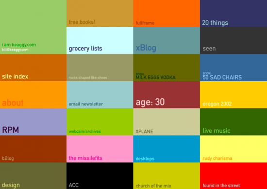
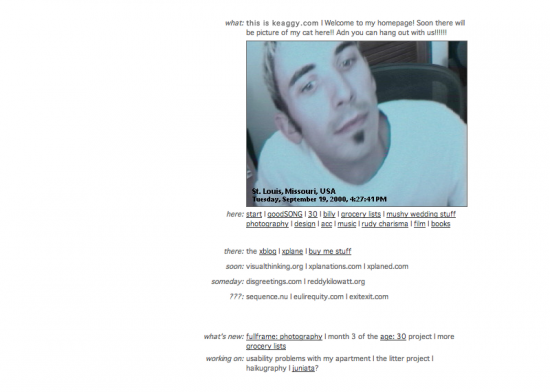
For a while my home page was just this image. But as I started adding projects to it in 2000, I realized I needed a better front door.
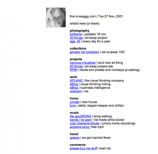
The original served its purpose for a while, but the site kept growing, and I kept coming up with ideas for projects, so I tweaked it in mid 2001.
You can see how that lame design is basically just a bunch of empty threats. Look how many things I am going to add to the site someday! Look!
Well, it has sort of come true. So I redesigned the keaggy.com home page. Just like the site, it’s now a confusing but serendipitous grid of projects, and will only grow more more overwhelming over time. And that’s not a threat.
I do a lot of design at XPLANE that has to make complex ideas simple, be easy to use, and be easy to understand. I can do that. But sometimes when I come home I don’t want to do that — and that’s how I ended up with this dead simple, but anxiety-inducing, page of rectangles.
I hope you like it. It’s keaggy.com v4.
This post was published retroactively in 2012 from previously posted sources.
Update, September 2013: After 11+ years I archived the old home page and now we are on v5.0—with a proper portfolio and blog.


